2026
Liberty Fusion
Brand system and website for an American fusion energy company
Context
Liberty Fusion is building a fusion power company in New Mexico. Its reactor approach, Plasma-Jet-Driven Magneto-Inertial Fusion (PJMIF), came out of the Plasma Liner Experiment (PLX) at Los Alamos National Laboratory (LANL) and the ARPA-E fusion program. The aim is clean, continuous power from fusion, engineered for reality.
Fusion is having a loud decade. A lot of companies, a lot of capital, and messaging that mostly sounds the same. A young company in that field has to explain something genuinely difficult, plasma physics, to investors, recruits, partners, and policymakers who aren't physicists. And it has to feel like itself, not like the next startup chasing the same headline.
Liberty Fusion came to me with two strong things already in place: the name, and a clear instinct to lean into an American, founding-era story. What it didn't have was any of it made real. No logomark, no website, no system. My job was to take the idea and turn it into something that exists and works, and then to keep building on it.
The Logomark
I designed the logomark from scratch. A 7-ray crown drawn from the Statue of Liberty sitting above 2 curved arcs that rise toward each other. The arcs are the fuel, deuterium and tritium. The rays are the plasma jets that drive the reaction. Between them, a negative-space triangular cutout marks the point where everything converges: the spark, the moment of fusion. The reaction sits at the center of the mark.
The numbers are deliberate. 7 rays, for the rays of Statue of Liberty's crown and for the early 7-gun phase of the Plasma Liner Experiment at Los Alamos, an important origin point of the technology. There are also 7 plasma guns in every modular unit as planned for the future commercial fusion reactor design. 7 rays and 2 arcs give the mark 9 parts in total, and 9 carries the final PLX milestone: the 36-gun experiment (3+6=9). A familiar American symbol, with the history of the physics built into it.
Of course the logomark also looks like an optimistic sun with 7 rays shining from behind the horizon of our planet, encoding the limitless energy equal to the sun being brought down to earth safely for a bright future ahead for all of humanity.
Constitutional Futurism
The founding-era instinct needed a design language to become real. I named that language Constitutional Futurism: the craft of the American founding, its engraving and typography, set against the hard edges of a deep-tech future.
This isn't the whole brand. Constitutional Futurism is the register Liberty Fusion uses when it speaks about its values and intent, the Declaration of Energy Independence, a fusion-era Bill of Rights, the conceptual pieces. There it goes full founding-era: serif type, richer styling, the weight of a document that's meant to mean something.
Everywhere else the brand is modern and forward-looking. Mostly black and white, minimalist and clean, set in the geometric sans Outfit, with gold and blue as accents. Clean and technical, built for a company working at the front edge of physics. The two registers give Liberty Fusion range. It can read like a founding document when it's making a case, and like an engineering company the rest of the time.
The Website
The website is live at libertyfusion.com. I designed it, built it, and run it: the design, the front-end, the content, and all the infrastructure behind it. It's a custom build on a modern tech stack, with the kind of attention to detail and turnover you get when one person owns every layer and nothing has to survive a handoff.
Information Architecture as Narrative
The whole site is organized around the documents and ideas of the American founding. Each one maps to a part of the fusion story.
- ·Declaration. A Declaration of Energy Independence. The mission, stated plainly.
- ·Common Science. After Thomas Paine's Common Sense. Fusion explained without the jargon.
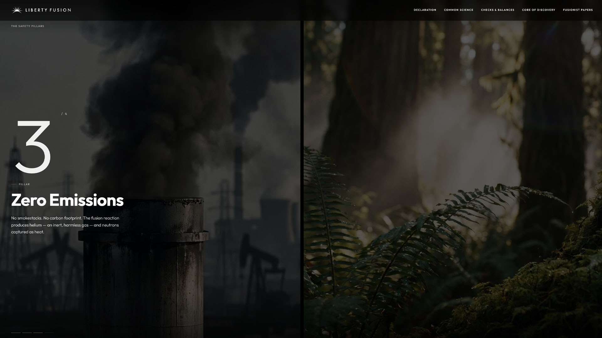
- ·Checks & Balances. Why the reactor is safe by design.
- ·Core of Discovery. After the Corps of Discovery. A roadmap of the path to commercial fusion.
- ·Fusionist Papers. After the Federalist Papers. The company's own writings (blog/news).
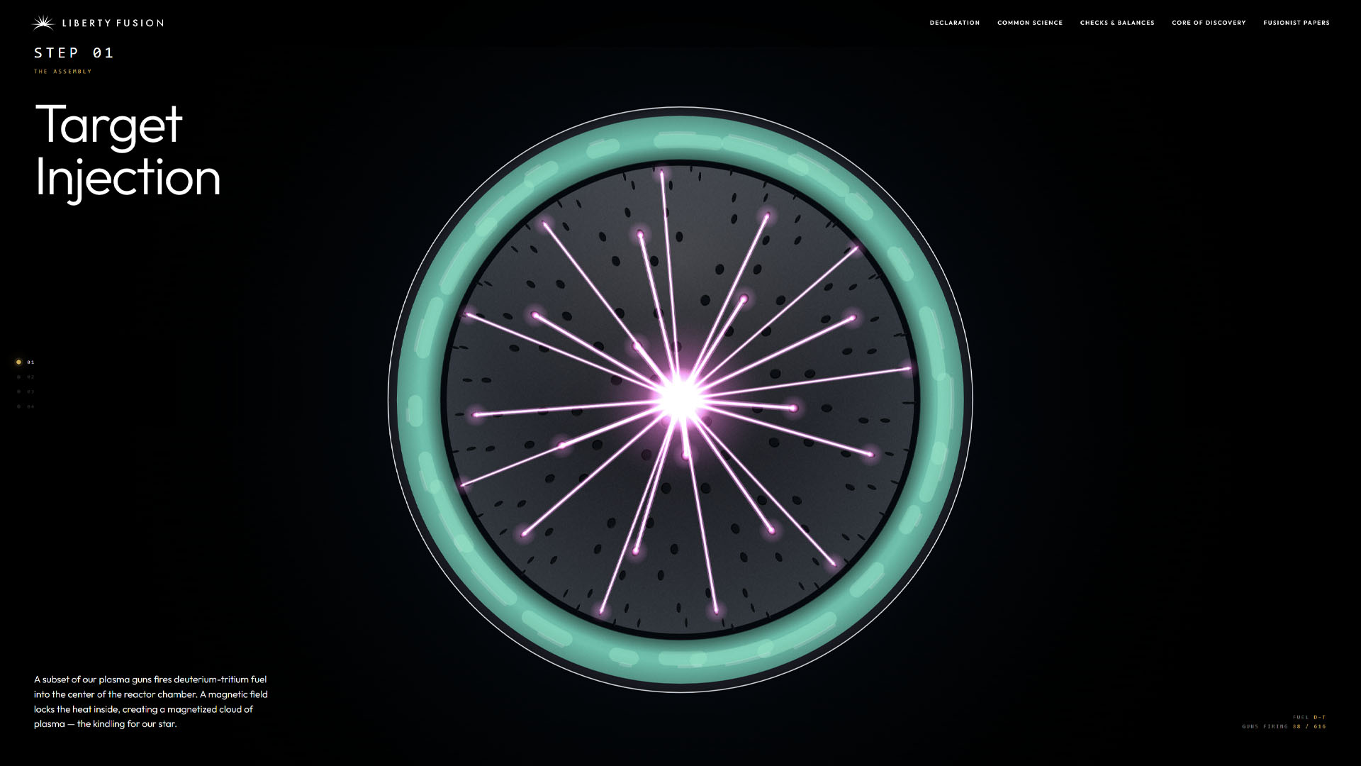
Making the Science Legible
The hardest content problem was Common Science: explaining the reactor to someone with no physics background, without making it too complex or dishonest. I built it as a guided walkthrough, from the basics of fusion to the reactor itself in four animated stages, with live counters tracking the reaction as it fires. It ends on the real research, 40 peer-reviewed papers behind the technology, so the accessible version up top stays anchored to something solid.
I crafted the content across the site too: the brand voice and the way the story and science gets told.
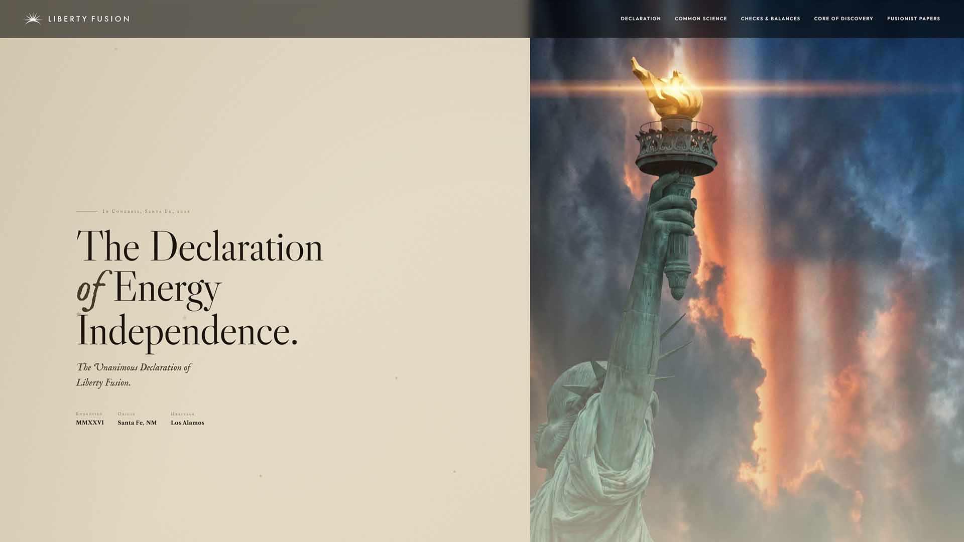
The Declaration Page
The Declaration of Energy Independence is where the site goes furthest in both design and motion. It's the full Constitutional Futurism treatment, built as a single long-scroll piece with choreographed animation and a Bill of Rights rail that tracks alongside the text as you read. It's an ambitious page on the site, and a clear example of what the brand sounds like when it speaks about its values.
The Brand Video
The hero video on the homepage is an original 33-second brand video I produced as well. It's the fastest way the site says what Liberty Fusion is and what it stands for, before anyone reads a word past the main welcoming headline.
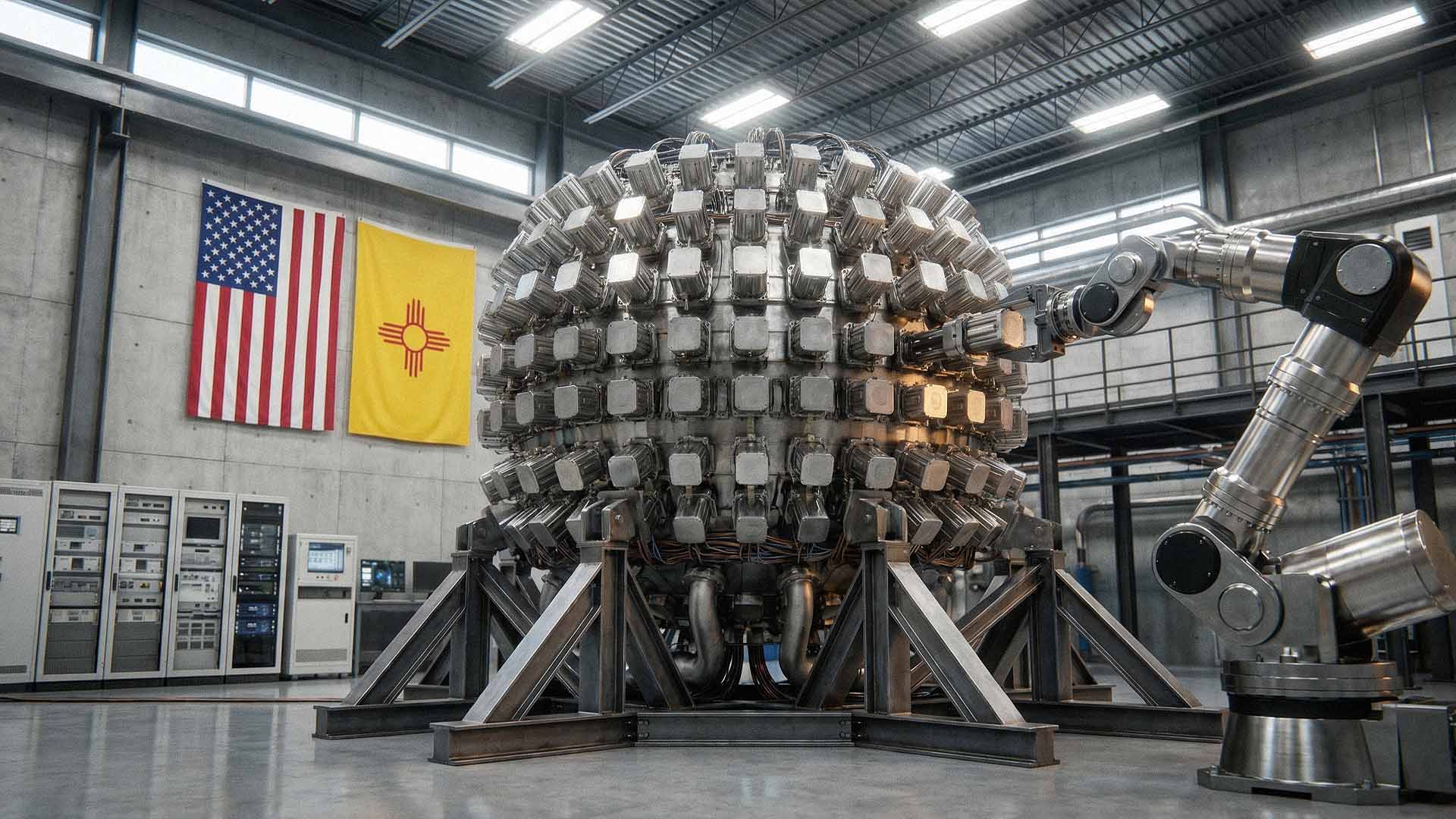
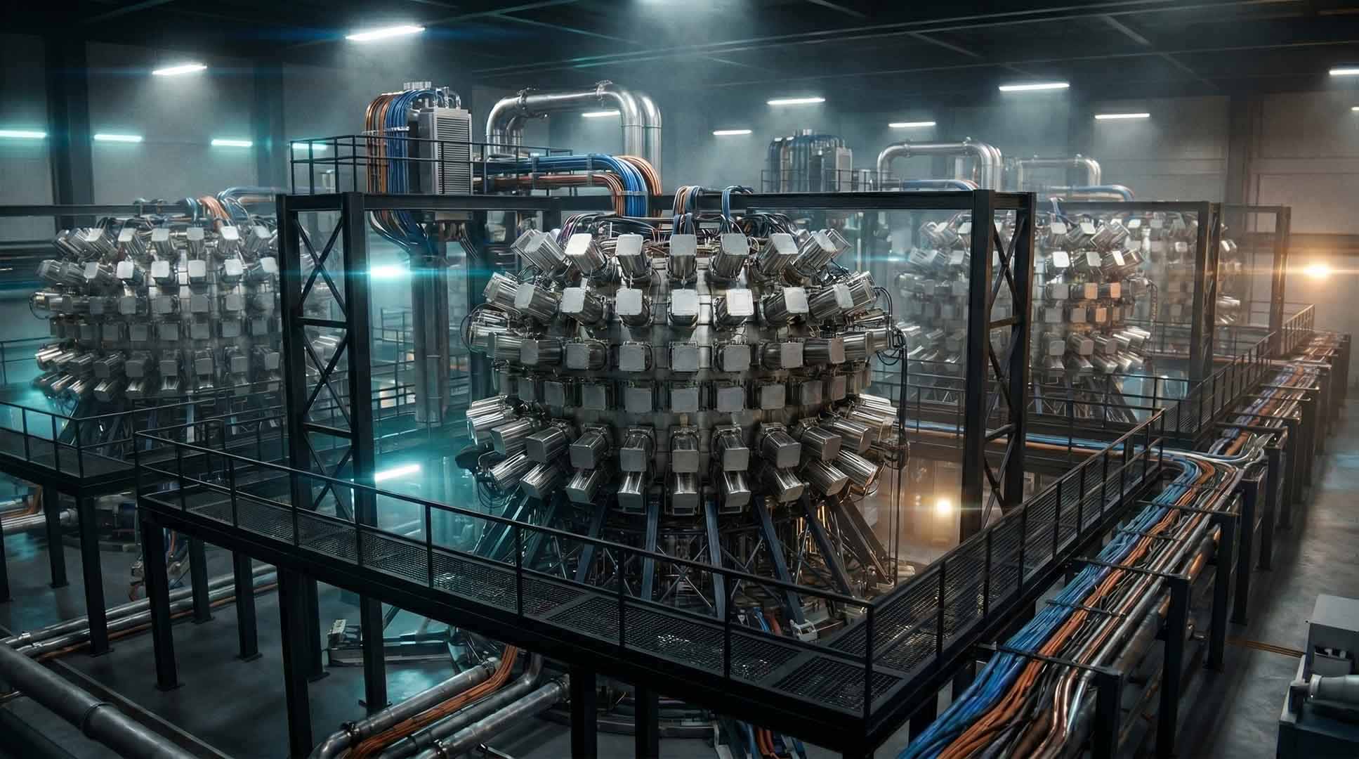
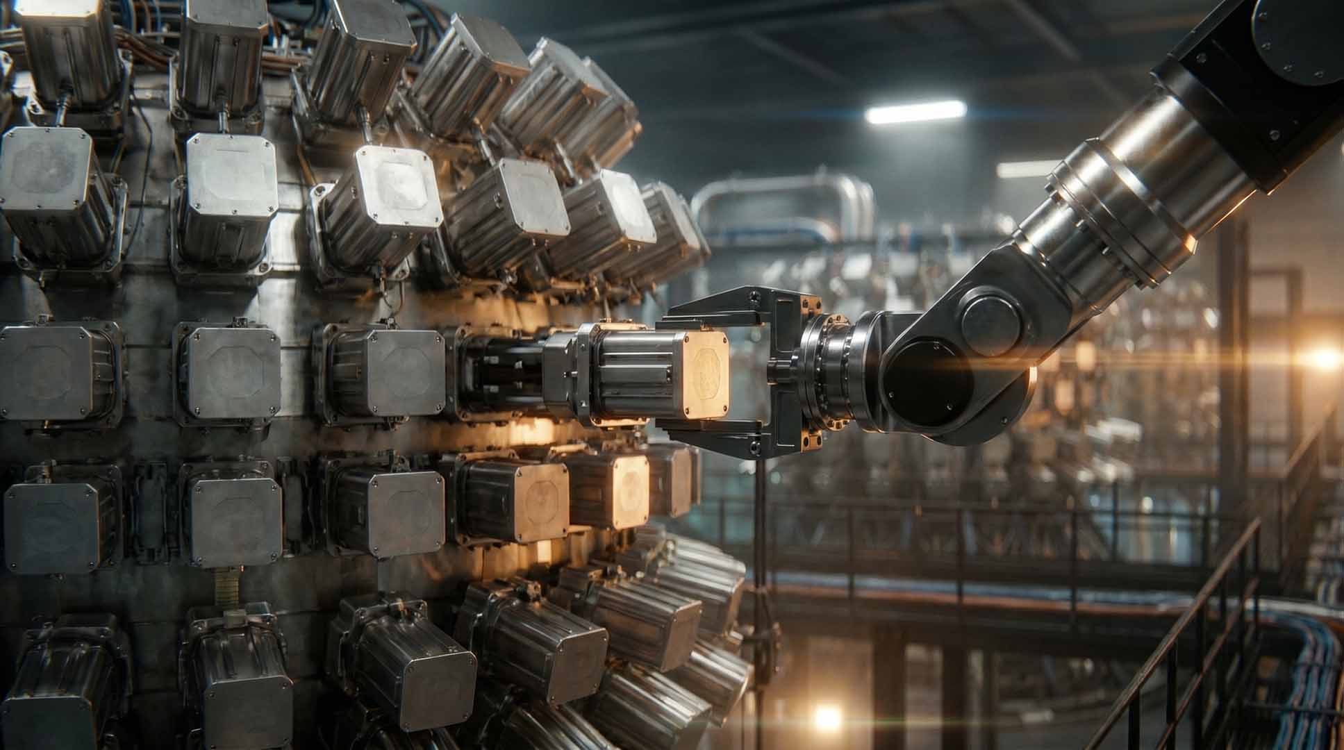
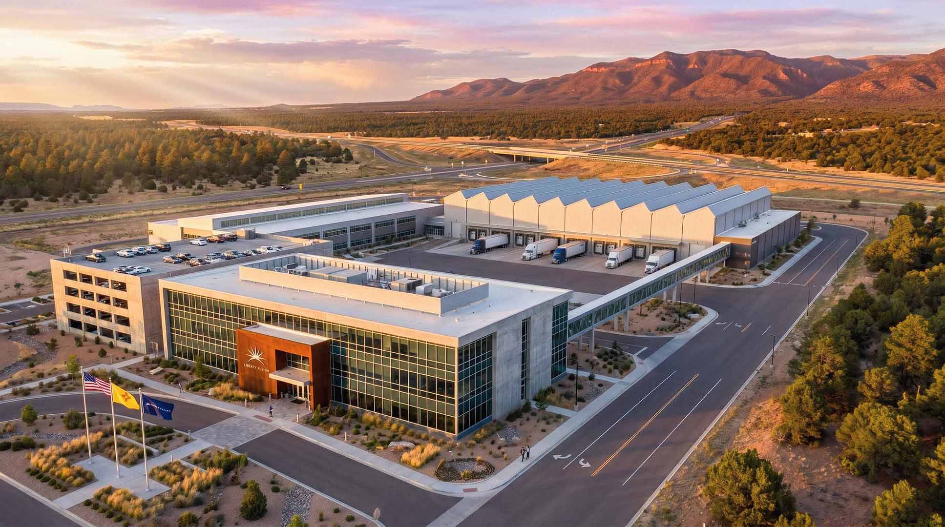
Visualizing the Future
A fusion plant like the one Liberty Fusion is building doesn't exist yet, so there was nothing to photograph. I directed a library of AI-generated images for the brand: reactor interiors, power plants, the New Mexico siting, all in the company's visual language. This is art direction via AI prompting. I treated the models like a camera I had to direct, pushing for a consistent look, materials that read as real, and a near-future world that feels engineered rather than sci-fi. The best of them look less like concept art and more like photographs from a few years out.
The Brand Operating System
The website was the first surface. The larger piece of work, now in progress, is the brand operating system: the documented, governed version of everything the company has been building.
It expands the identity well beyond the logo, color, typography, iconography, imagery and motion direction, and a data-visualization language for a company whose story is full of charts and technical diagrams, plus a sub-brand system for its individual projects. It includes the templates the company runs on, from decks and one-pagers to technical reports and press formats, and the documentation that keeps everything coherent as the team and the roadmap grow. Investor and pitch decks, marketing design, and the social media system. One identity, applied consistently across every surface the company puts in front of people.
The full system will live in two places: an internal platform for the team, and an external brand site that lays out everything from brand voice and audiences to the working files and ready-to-use templates. This is the part of the engagement that's still being built.
Impact
Reflection
The science and technology are the most interesting things about Liberty Fusion, and most of the design decisions on the site come back to making it understandable and bringing it to life visually while keeping it honest and realistic.
Owning the whole stack is a major advantage. Designing the brand, writing the copy, building the site, and running the infrastructure myself means nothing gets lost between disciplines. For a young startup operating lean and trying to look credible while it does something genuinely hard, that coherence is very valuable.